City of Toledo
Brand
Completed: February, 2020
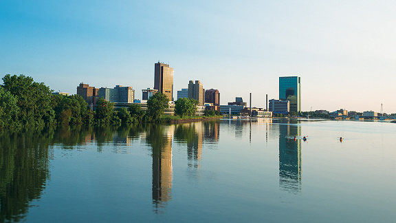
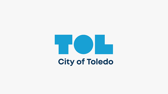
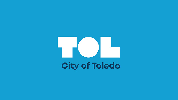
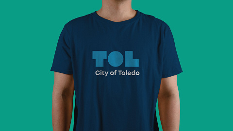
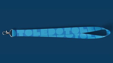
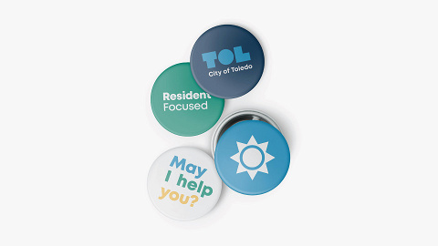
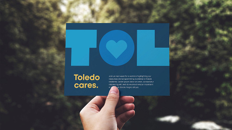
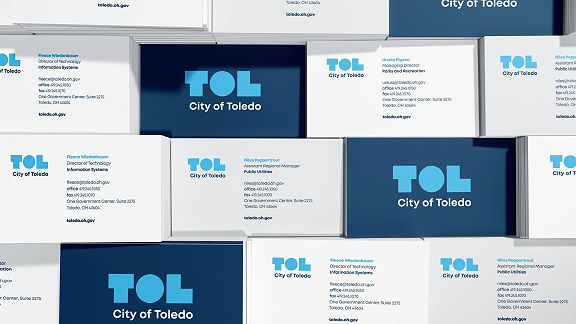
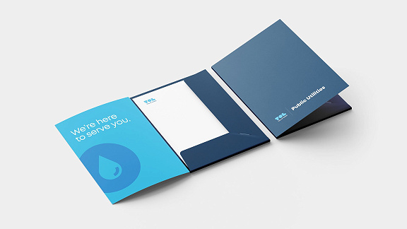
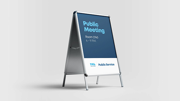
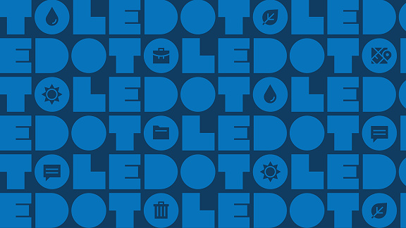
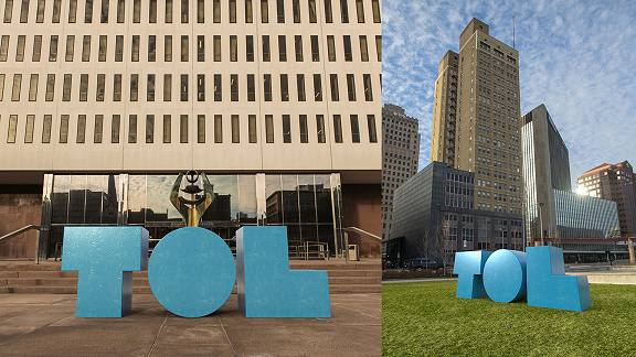
The City of Toledo brand began with the goal of centering the brand around the resident’s experience. The brand is bold, just like the city itself. The geometric logo and typography, as well as the bright palette, balance a playful and hardworking tone. Using data-driven decisions, each aspect of the City of Toledo brand was developed with guidelines for accessibility and inclusivity in mind. Maintaining a consistent voice and appearance across the many facets of the brand required an airtight system with clear and usable guidelines.

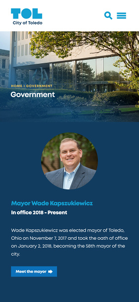
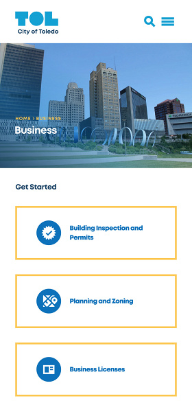
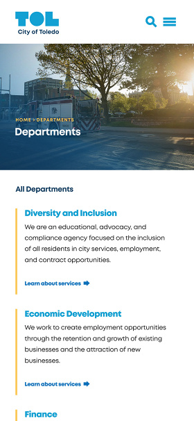
Website
Completed: September, 2020
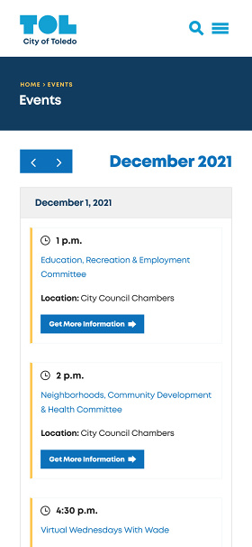
As the brand took shape, the website came into play. The structure and design of the website was heavily informed by user data. By studying analytics and city insights, we were able to identify and prioritize the features and tasks visitors are most likely to be looking to complete. From the simple navigation, to the fast load speed, to the fully accessible and user-tested layouts, the website keeps residents at the heart of the design.
Related Links:
Website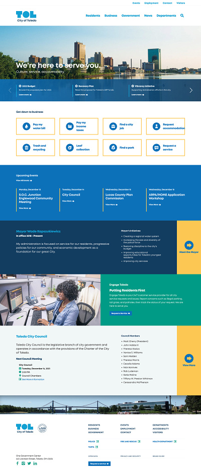
Contact Us
hello@madmadmad.comCopyright © 2025 Madhouse Creative LLC. All Rights Reserved.