Grosse Pointe Public Library
Brand
Completed: December, 2018
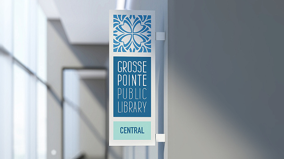
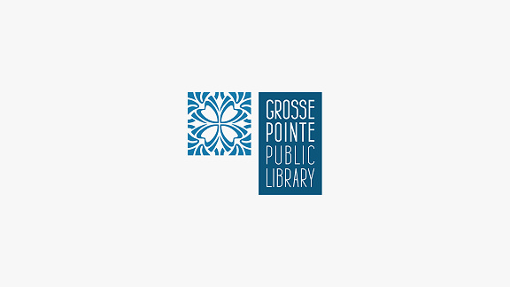
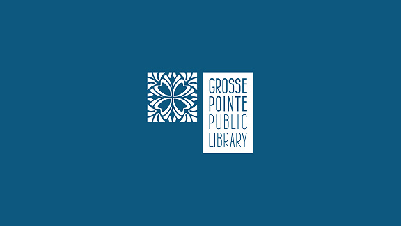
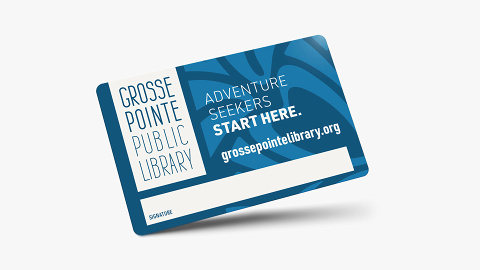
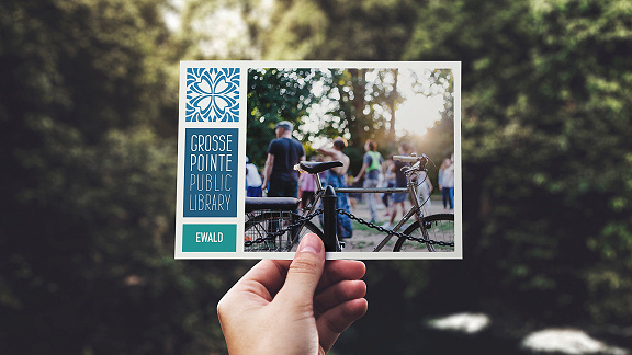
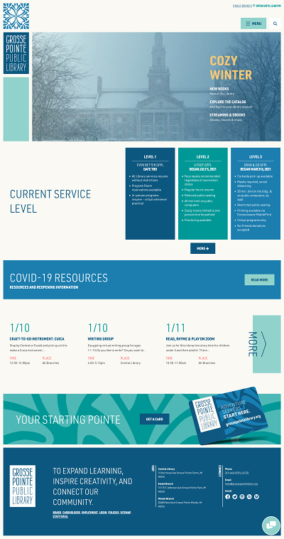
The library system’s pewabic tile-inspired stamp carried both brand recognition and community relevance. Madhouse updated the existing mark to give a fresh feel. We then added custom modern type, inspired by the central branch’s mid-century modern signage. With the help of a brighter color palette, the result is an updated brand that maintains all recognition.
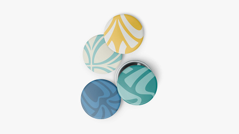
Using the pewabic stamp as oversized, abstract background shapes adds additional texture and character to the visual language of the brand. The brand is further built out to follow a logo-based grid system.

Website
Completed: December, 2018
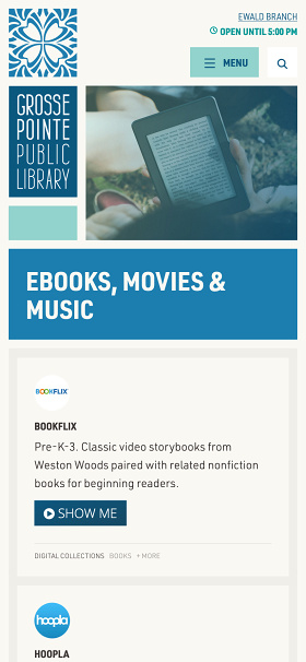
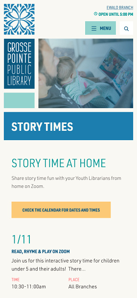
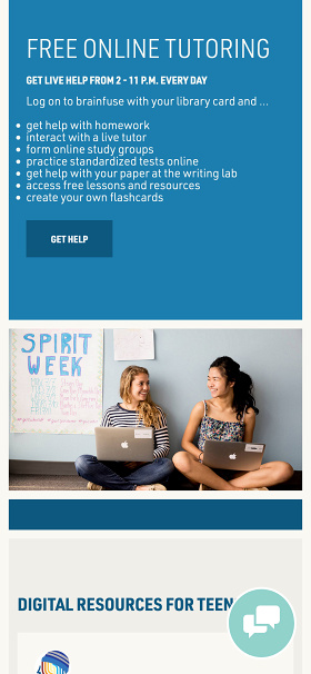
A truly beautiful website is equal parts form and function. As the library is a truly open and inclusive place, so too must be their website. Built to ADA standards for accessibility, fully responsive and optimized to perform quickly, we strive for experiences that work for humans — not robots.
Much as a librarian might guide you through a physical space, the website seeks to guide users through by presenting content in collections, organized by theme or audience. The curious clusters are made possible by a custom content management system that makes pieces of content both reusable and customizable for optimal content design.
Related Links:
Website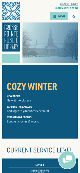
Contact Us
hello@madmadmad.comCopyright © 2025 Madhouse Creative LLC. All Rights Reserved.